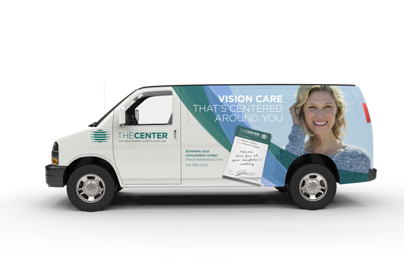
Boost Results: Success Stories

Carpe Diem Guesthouse and Namaste Spa:
Rebrand, identity, website, advertising, print collateral, signage, vehicle wraps,
and merchandising

Challenge

Carpe Diem is an extraordinary boutique guesthouse in Provincetown, Ma. Carpe’s former identity, website, and collateral was inconsistent, confusing, and uninspired. Moreover, it did not capture the distinctive personality of this Euro-Asian influenced gem.

Solution

We began the carpe re-brand with the identity, the cornerstone of a brand’s re-design. We selected a serif font with subtle curves and a palette of gold, black and white to reflect the inn’s regal ambience and euro-asian influences. Also, we used a mirror-image to create an identity for the on-site spa to work in harmony with the Inn’s mark, yet remain distinctive. Once we established a new identity, we infused the site’s look and feel with the Euro-Asian elements of the new brand. We replaced the heavy blue and white colors, small photos, confusing navigation, and minimal content with the brand’s new logo and striking color palette, a large photo window, a curved and easy-to-use nav bar and rewrote the content.

Result

We brought all the elements together to convey luxury, comfort, and quality in one cohesive brand. The site now showcases the true essence of this world-class Inn, and it has been fully booked since the brand launch.

Lexicon: the words we live by

font

Historically, a font is a given alphabet and its associated characters of a single size and style containing all the letters, numbers, and marks needed for typesetting. This used to be an actual box that held the pieces of lead and wood of a particular typeface. These pieces of type would be arranged on strips of metal that would determine the spacing above and below each row of type in a paragraph, called “leading”. The physical weight and size of these pieces would prohibit storing all of them in one font box. Now type is held in a font folder on a computer, and it can hold all the various sizes and styles of a particular typeface, not just one. Designating a specific type inside a typeface is what is called the font.

use it in real life: Lets say you are looking at a paragraph of type in a magazine. You like the way it looks and want to know what it is. You ask “what is that typeface?” The answer is Times. Then you ask “what font is that paragraph set to?” And the answer is Times italic 12 point.

another example: You want to type an email. You go to the font folder which holds all of your typefaces of various sizes and kinds. You select Times roman 12 point. Times is the typeface, and Times roman 12 point is the font.

see also: font


Boost Community: stories about the people we know, the places we go

Forks and Corks Food and Wine Festival

This Sunday, Boost attended our first Corks and Forks event at Ringling Museum of Art. We were warmly greeted at the entrance by our friend Douglas Kingsley, Supervisor of Security for Ringling, who also happens to be an artist and musician and solos on the Ca’ d’Zan piano during the holiday season.

Soon after arriving, we bumped into Virginia and Jeff Orenstein, owners of Living on the Suncoast Magazine. Jeff joked that we must be following him, as we attend many of the same events around town. Jeff, with his ever-present camera and Ginny, who is the epitome of style and grace, are the powerhouse couple behind the recent transformation of Living Out East into Living on the Suncoast, the most widely-distributed publication in the area. Lets raise a glass to that!

A little wine and food later, we chatted with Douglas about how RIngling was a beautiful venue for such a fabulous event. There is so much to enjoy, its almost overwhelming. As we were winding down, we noticed a chic woman in an Audrey Hepburn hat who turned out to be Marnie Matarese from J. Wood Realty. J.Wood is hot, hot these days, with million-dollar listings and sales. We promised to visit the office next week for one of her “Cocktails and Tall Tales” socials, that are so popular, even celebrities like James Woods stop by when they are in town.

As we were leaving, we were happy to see Deb Clark, sales maven from Sarasota Magazine and meet Sonia Velasco, marketing coordinator for Cosimos. We are hoping to catch-up with Deb this week and learn more about her latest projects. That’s all for now. See you in paradise!